← All work

Vol. 01 — Selected Logos & Marks

Logofolio

Every logo starts with a story. Here are some of the marks I've designed — the idea behind each one, how it's built, and how it lives on the brand.

Marks
06
Years
2024–2025
Services
Logo · Identity · Applications
012024 GazginTravel & booking app
01

Gazgin

Client
Gazgin startup
Industry
Travel & booking app
Year
2024
Services
Logo, brand identity, app icon

A compass for discovering Azerbaijan.

“Gəzgin” means traveler in Azerbaijani — someone who is always on the road, curious about what is behind the next mountain. The logo had to carry that feeling of discovery.

I built the mark around a compass. Inside it sit the landscapes people travel for: mountains, forest, fields and the Caspian sea. The diagonal needle cuts through all of them, pointing the way to the next journey.

Clean line art keeps the mark readable at small sizes, while the fresh greens and blues bring the energy of nature into the app.

  • Compass
  • Discovery
  • Nature
  • Journey
Construction & grid
Royal Blue#3058B8
Sea Blue#0878E0
Aqua#10E0B0
Lime#A8E040
White#FFFFFF
Aa
RobotoPrimary typeface
Color & type
Primary
On brand color
On dark
Mono
Name SurnameFounder · Gazgin
Business cards
9:41
Gazgin
App icon
Storefront sign
Merch
Next mark · Ataman Construction ↓
022025 Ataman ConstructionConstruction company
02

Ataman Construction

Client
Ataman Construction
Industry
Construction company
Year
2025
Services
Logo, brand identity, applications

Rising from a strong foundation.

“Ataman” is an old Turkic word for a leader — the one others trust to guide the way. For a construction company, that meant a brand that feels solid, confident and built to last.

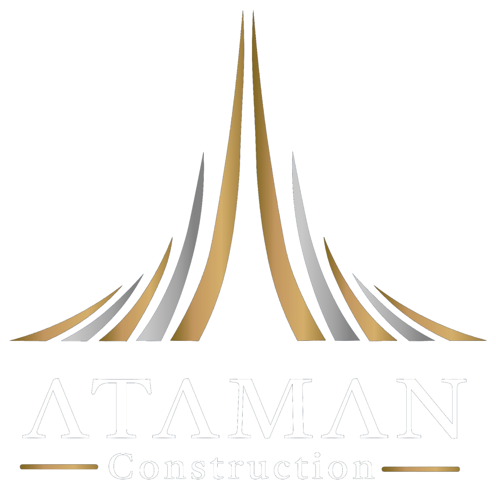
The mark is made of lines that rise from one shared base and meet in a tall central spire, like a building growing floor by floor towards the sky. Its perfect symmetry speaks of balance, precision and stability — the core of every good structure.

Gold and silver bring the feeling of premium materials and steel, set on a deep navy background. In the wordmark, the letter A loses its crossbar and becomes a sharp “Λ”, repeating the peak of the spire in every A of the name.

  • Leadership
  • Foundation
  • Growth
  • Precision
Construction & grid
Deep Navy#010E1F
Gold#D4AF6A
Bronze#8A6A2E
Silver#C9C9C9
Graphite#333333
Aa
Serif wordmarkPrimary typeface
Color & type
Primary
On brand color
On dark
Mono
Name SurnameFounder · Ataman Construction
Business cards
9:41
Ataman
App icon
Storefront sign
Merch
Next mark · FELAS ↓
032025 FELASLawyers' association
03

FELAS

Client
Foreign Educated Lawyers' Association
Industry
Lawyers' association
Year
2025
Services
Logo, brand identity

Many paths, one community.

FELAS — the Foreign Educated Lawyers' Association — brings together lawyers who studied abroad and came back with knowledge from different countries and legal systems. The identity had to show both sides: international experience and one united community.

The symbol is a rosette of interlocking blue arcs. Like meridians on a globe, they come from different directions, cross each other and meet around one shared center. The golden dots around the circle stand for the members — individual people forming one strong ring.

Blue brings the trust and professionalism expected from law, while the golden yellow adds warmth and the light of knowledge. A thin yellow line separates the mark from a calm, readable wordmark, giving the logo a balanced, official look.

  • Community
  • Global
  • Trust
  • Knowledge
Construction & grid
Trust Blue#0A72B8
Golden Yellow#EDB200
Deep Navy#152333
Ink#231F20
White#FFFFFF
Aa
Humanist sans-serifPrimary typeface
Color & type
Primary
On brand color
On dark
Mono
Name SurnameFounder · FELAS
Business cards
9:41
FELAS
App icon
Storefront sign
Merch
Next mark · Level Med ↓
042025 Level MedKorean skincare manufacturer
04

Level Med

Client
Level Med
Industry
Korean skincare manufacturer
Year
2025
Services
Logo, brand identity, packaging

Skincare, taken to the next level.

Level Med produces skincare products in Korea — the home of modern beauty innovation. The name joins two ideas: “Level”, taking your skin to the next level, and “Med”, the medical precision behind every formula.

The wordmark is built from clean, separated bars with sharp cut corners. Like layers of skin or steps on a scale, the strokes stack into letters, and the E’s are literally made of three levels. The V combines a triangle with a sharp diagonal, forming a tick — a quiet sign of tested, approved quality.

A silver metallic finish gives the brand a clinical, premium feel that looks at home on a laboratory shelf and a luxury vanity alike — especially on matte black packaging.

  • Precision
  • Layers
  • Clinical
  • Premium
Construction & grid
Silver#BDBDBD
Pearl#E9E9E9
Chrome#8C8C8C
Charcoal#232325
White#FFFFFF
Aa
Geometric displayPrimary typeface
Color & type
Primary
On brand color
On dark
Mono
Hydrating Serum · 50 ml
Daily Cream
Packaging
Name SurnameFounder · Level Med
Business cards
9:41
Level
App icon
Storefront sign
Merch
Next mark · Grandiose Jewellery ↓
052025 Grandiose JewelleryJewellery brand
05

Grandiose Jewellery

Client
Grandiose Jewellery
Industry
Jewellery brand
Year
2025
Services
Logo, brand identity, packaging

A seal of timeless elegance.

“Grandiose” means magnificent — impressive in size and beauty. For a jewellery brand, the logo had to feel like a precious object itself: rich, balanced and made to last for generations.

The symbol is a perfect circle — a ring, a symbol of eternity — filled with four interlocking G-shaped hooks that turn around one center. Together they form an elegant ornament that recalls ancient seals and classic jewellery patterns, while the repeated G quietly carries the brand’s initial.

Rendered in polished gold with an engraved, three-dimensional finish and paired with a classic serif wordmark, the identity shines brightest on deep emerald boxes and velvet packaging.

  • Eternity
  • Seal
  • Gold
  • Heritage
Construction & grid
Royal Gold#C09C24
Light Gold#D8B448
Antique Gold#846C00
Emerald Night#13261F
Ivory#F5EFE0
Aa
Classic serifPrimary typeface
Color & type
Primary
On brand color
On dark
Mono
Jewellery box
Name SurnameFounder · Grandiose Jewellery
Business cards
9:41
Grandiose
App icon
Storefront sign
Merch
Next mark · Ner Plast ↓
062025 Ner PlastPipe production & sales
06

Ner Plast

Client
Ner Plast
Industry
Pipe production & sales
Year
2025
Services
Logo, brand identity

Cold and hot, flowing as one.

Ner Plast manufactures and sells plastic pipes for water supply and heating systems. The brand needed a symbol that instantly explains what flows through its products.

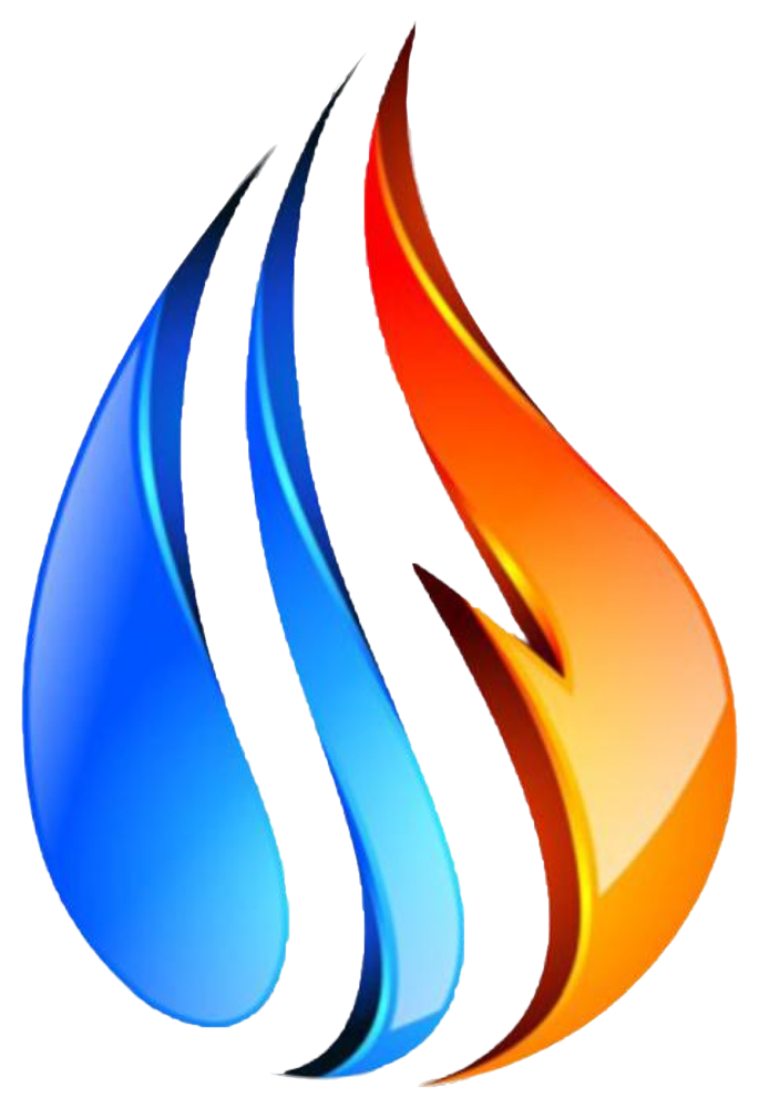
The mark is a single drop made of three flowing strokes. Two blue strokes stand for cold water, while the third turns into a red-orange flame — hot water and heating. Side by side they show one system that carries both, smoothly and safely.

The name repeats the same idea: “NER” in water blue and “PLAST” in flame orange. A glossy, three-dimensional finish echoes the smooth surface of modern plastic pipes.

  • Water
  • Heat
  • Flow
  • Reliability
Construction & grid
Water Blue#0054FC
Sky#3FC1F5
Flame Orange#E45400
Amber#FC9000
White#FFFFFF
Aa
Bold serifPrimary typeface
Color & type
Primary
On brand color
On dark
Mono
NER PLAST · PPR-RCT · Ø32 × 5.4 · PN20 · DRINKING WATER & HEATINGNER PLAST · PPR-RCT · Ø32 × 5.4 · PN20 · DRINKING WATER & HEATINGNER PLAST · PPR-RCT · Ø32 × 5.4 · PN20 · DRINKING WATER & HEATING

Product print
Name SurnameFounder · Ner Plast
Business cards
9:41
Ner
App icon
Storefront sign
Merch
Back to index ↑

Need a logo?

Let's talk